Wow. I knew that It's been quite a while since my last post,
but I just realized it's already December! Time flies!
Like Laura, I've been crazy busy especially in the past month.
Internship forms, ISP posterboards, Seminar papers, Core homework...
Everything seemed to be flooding over me that I needed some time settling down and figuring things out.
Finally, after a few weeks, I feel like I'm getting there.
SOOOOO!
Today I'm going to talk about my Independent Student Project (ISP).
Yes, my ISP, separate from the group's.
It took a long, long way for my project to shape into its current form,
but I'm gonna try shortening all that into one blog post.
Beginnings (that were nothing like the end)
About a month and a half ago, I wanted to apply for a digital marketing summer internship at Jacob's Pillows Festival. Two of the requirements to be intern was proficiency in Adobe Suite products (Photoshop, InDesign, Illustrator) and basic computer programming skills. I didn't have any. Also, as a third year Art major, I had to prepare for an exhibition before graduation. So, I naturally tried to utilize this ISP opportunity to achieve both of them by making some type of digital artwork--something I could make art out of, while at the same time learning computer and software. I decided to do a digital collage.
Now that I had the medium set, I needed a subject.
Who or what should I depict? Should it be completely abstract? Political? Just aesthetically awesome?
After a few days grappling my head and searching for my subject, I thought I should do something edgy and fashiony--things that I am interested in. A look-book, maybe? A fashion illustration? Then, BOOM, I thought of a cool thing to explore more about: mannequins. I think I wrote on my proposal that I'll find different mannequins at different retail stores, compare and contrast them, change the interaction of it and its original environment and creatively use it beyond the fashion context. To start, I went out downtown and took some mannequin pictures:
These plastic models are from American Apparel near State street. After taking photos, I incorporated them to the demo versions of my collage. I wanted to somehow poke fun at the nipples, though maybe not done so well here:
Realizations
After getting hyped about mannequins, I told my friends, told my adviser, Jason,
"I'm going to make art out of mannequins!" Both of them seemed to be super excited, and so was I. Jason told me that this topic had so much potential, and there were many ways I could take it.
Then he asked me, "Why mannequins?"
Well, I honestly didn't have an answer for that. I just thought they were cool and interesting.
He said it really was cool and visually interesting, too, but he also felt that it didn't have a core, something really meaningful and purposeful. It wasn't meaty. Why the oranges? Why a stock image of oranges? What do these mannequins reflect, and how do they do that?
Still, Jason reminded me that my art doesn't need to carry any weight at all. In the end, it was all up to me.
Although it didn't really matter what art I make and whether it should be socially significant and what not (after all, I just wanted to be an Adobe pro), I didn't want to make bull shit, either. I wanted it to be meaningful and interesting. To do that, I may have had to discard the mannequin and find something I truly cared about.
But where did I have to restart?
New Directions
I had to take a step back and rethink. The topic had to be something that resonated for me, and at the same time was relatable for others. Then, I realized the best way to approach the universal was to start from the personal. The experience I chose was cat-calling.
It's one of the most interesting and often intimidating experiences I've had in the city. All I did was wear makeup and a dress, and I get unasked stares, comments, whistles. Many of my (largely) female friends have been cat-called as well. Whether we want it or not, we could only ignore it and carry on. Each person has mixed feelings about the issue, with mine being more negative. And for my project I decided to bring it up in more general terms--the male gaze--and explored ways to subvert it.
Now, don't get me wrong; I'm not an expert in feminism or gender studies. I have never taken a course in the field, though I have read a few feminist literature just for my ISP, such as "The Feminine Mystique" by Betty Friedan and "Visual Pleasure and Narrative Cinema" by Laura Mulvey. So, I may actually know as little or as much as you do. However, knowing that the objectification of female body/sexuality (and other feminist topics included in my art) have been common issues experienced by all women in some form or level, I thought this subject would come across as more than familiar for many of us.
The Process
Before I reach the end result, here's a documentation of my creative process:
First drawings on sketchbook by permanent marker
Exploring my own body and reflection of my visage by taking photos
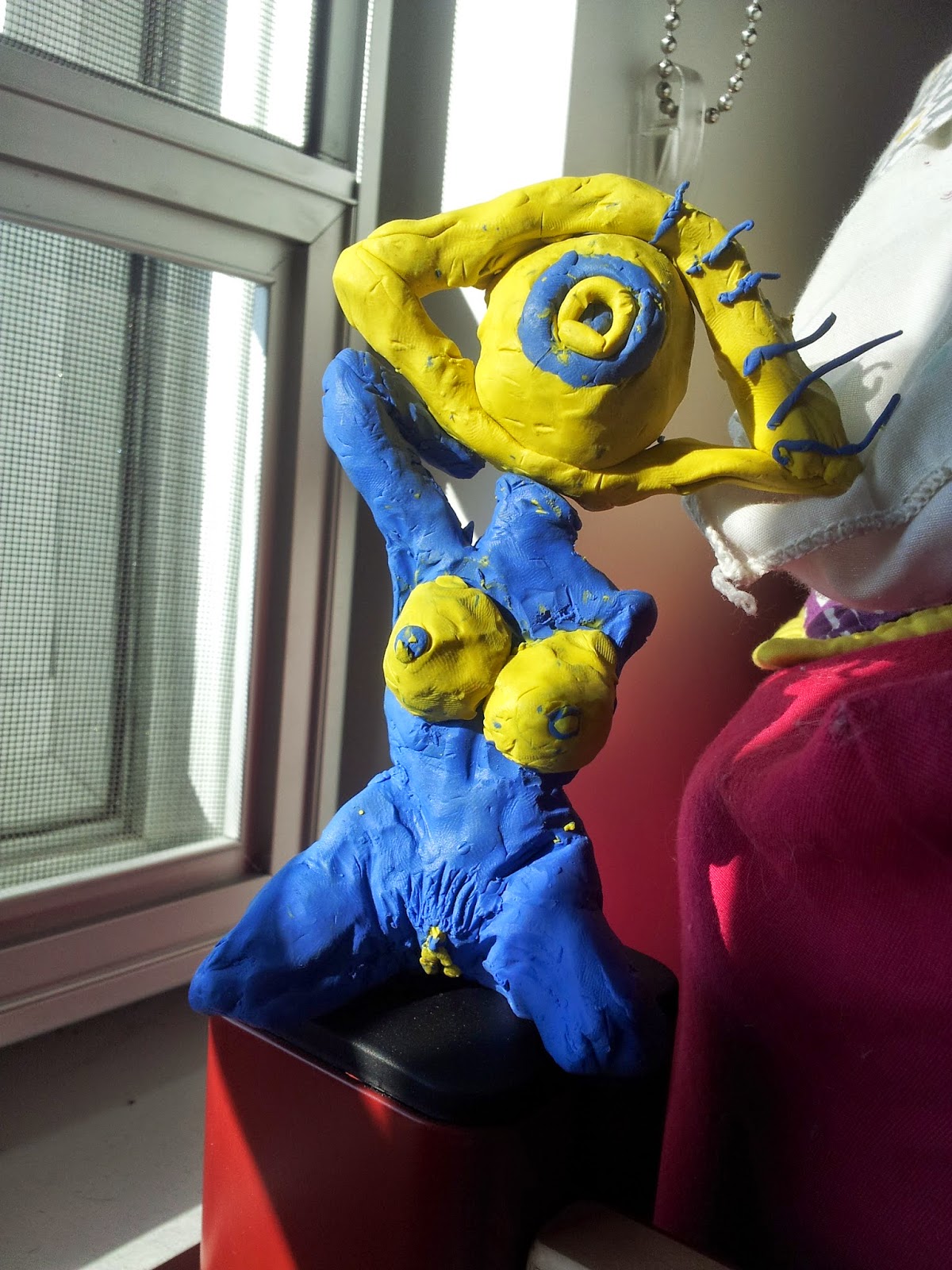
Sculpting surreal bodies and eyes using clay
This
seems like extra, petty work, but doing each of these smaller exercises
really helped me develop and finalize my ISP end-product.
Seriously--after finally choosing 'rejecting the gaze, embracing the
body' as my final topic, I had no idea where or how to start creating
the art. All the conceptualizing smart stuff overwhelmed me to an
unproductive degree. Luckily, Jason was there to advise me into taking
these baby steps. I took his words, and it proved more than helpful.
And Now...The Result


No comments:
Post a Comment